I’m going through some old twitter bookmarks again and found this gem from Troy Hunt. He has printer problems then has to go through some awful “user experience” with the Epson diagnostic program which seems a bit of a wind-up.
It features such delights as
“Is the printer turned on?” with the button “Ok”.
“Problems are found. Fix them.” with the button “Ok”.
The level of absolute absurdity with @EpsonAust's printer software is… let me just show you:
At work, whenever we need to log into a website, it displays a custom login screen. The text box labelled “Sign in” has the following text
“Enter user name as instructed below in GREY Box”
At the bottom, there is a grey box:
“Enter the password associated with your username”
The text box actually wants your email address but tells you to enter your username but to read the grey box. The grey box tells you to enter your password.
Even though our UX Team has been around for a while, they never seem to understand what is possible in our software, so end up designing something that we cannot accurately recreate from their Figma designs.
I often think their standards change over time so it’s hard to predict what they would come up with.
The UX Team asked what kind of formatting is possible in a Tooltip. You’d think they would know what is possible, and have plenty of old designs to refer to.
They said they had some upcoming projects that required tooltips containing large amounts of text; often with legal statements. They shared an example which had 3 sentences, then a Name, ID, Phone number, and address. So was a large amount of text in a tooltip, and some words were formatted.
I thought it wasn’t good UX to have loads of info inside a tooltip. Also, wouldn’t it be better to have that address somewhere where the user can copy and paste it? Seemed like a useful thing to have.
I often think it is good to evaluate the UX designs and give your own opinion on what’s possible to implement, but also suggest what would improve the user experience. You’d think the person employed in the UX team is the expert on user experience, but it’s best to not blindly accept it.
Cory House also seems to share this thought:
As a developer, I know I’m not a designer. But that doesn’t mean I should blindly implement designs.
As a developer, I know I’m not a designer. But that doesn’t mean I should blindly implement designs.
I push back on designs that are:
Insecure
Confusing
Incomplete
Inaccessible
Inconsistent
Not performant
Assuring a good user experience is everyone’s job.
Cory House
More specifically, if we have an existing dialog, and the UX team decides to change what it says; you would think this is the simplest change possible. However, there could be a bit more to it than you would think.
I was explaining this concept to a Junior Developer. I was saying how I loved working with a Product Owner called Rob, who always asked “is that a hard thing to do?” no matter how trivial something sounded. He understood that there could be all kinds of crazy designs in the code.
In theory, it should never be hard. But sometimes adding more words means the words need to wrap onto the next line, and if the dialog hasn’t been coded to resize, then it might be a manual resize job. But if the “design view” is broken, then that makes it even more complicated.
The text might not just be set to specific words in the file where the control is. It could be dynamically generated then passed into another method, or maybe it even is set and read from a database. It’s still easy to change, but if you tried to search the source code for a specific word/words then you might not find it if it is dynamic or in the database instead.
I’m sure there have been times where, after investigation, you are like
“Rob, can’t we just keep the words as they are, I don’t have the skills to add a few more words!”.
Dave Plummer, who has the Youtube channel Dave’s Garage announced on Twitter:
Big news! Someone finally noticed that if you hold down CTRL, the process list in Task Manager conveniently freezes so you can select rows without them jumping around. I did this so you could sort by CPU and other dynamic columns but then still be able to click stuff…
Dave Plummer
There’s been plenty of occasions where Task Manager rows jump around to my annoyance. Why wasn’t this a more obvious feature? Frank Krueger (who appears on Merge Conflict podcast) made the obvious point:
Don’t hide features under random key combos – undiscoverable and unmemorable UIs are user hostile. A little checkbox with the text “Pause Display” would be discoverable and you won’t have to wait 30 years for someone to find your feature.
I was getting a 503 error when trying to use Git. After searching for internet for solutions, I came across this “unicorns have taken over Error – 503“. I wondered what that was all about? Was it one of those stupid error pages some companies do as a joke?
In a recent blog, I remarked how we always seem a bit short-staffed when it comes to our UX team, who come up with the User Interface designs, provide icons, and write the user-facing text that appears on buttons and dialog boxes.
On our stand-up update, a developer, Andy, was explaining his interaction with a new member of the UX team. Just like a lot of recent hires, it seems we have just hired anyone that applied.
Andy wanted an icon, and they sent him a screenshot of the icon rather than the actual file.
So he asked for the actual icon file, and they sent him an icon file but it looked a bit different from the screenshot.
So he questioned if it was right, and they sent him the icon he expected, but he noticed it had a transparent background and he wanted white.
She is like “it is white, you can see it on my screenshot”, and he is like “no, it is showing as white because the graphics program’s background is white.”
It’s very alarming that we are hiring a UX designer that doesn’t seem to understand the concept of transparency and doesn’t understand to send the files she creates rather than screenshotting them. ¯\_( ͡° ͜ʖ ͡°)_/¯
This long blog documents what I have been working on for the past year. I had made lots of notes with the aim of writing a blog, in addition to taking extra notes from chat logs.
We actually estimated the project would take around 5 months, but then an extra 2 months for testing and go through our slow rollout process. It actually took closer to a year. I’d say it was a combination of:
realising the feature was more complicated than anticipated
the UX team had little knowledge of the actual user experience
managers changing or trying to change team members
We were told the project was important, yet we were only assigned 2 developers (as in myself and one other). As the project came to a close, we were being integrated into our new team, therefore other developers could help out during the final stages.
Here is a list of all the people involved over the project’s lifetime:
Name (Core team in bold)
Role
Me
Developer (Team Lead)
Daniel
Developer
Dean
Developer (Temporary)
Dennis
Developer (Temporary)
Tina
Tester
Tim
Tester
Colin
Technical Manager
Mary
Technical Manager
Olivia
Product Owner
Owen
Product Owner
Carl
Customer Representative
Adam
Architect
Andy
Architect
Grace
Safety & Legal Governance
Ulrika
UX
Ursula
UX
I’ve made the names start with a letter to represent their job title, apart from Colin because he is a recurring person in my blogs. I’ll put reminders throughout the blog so it is easy to follow.
Current Software
To protect anonymity, I need to come up with a different theme for what the software is for. Let’s say customers request various restricted items of different severity. So a request could come in for a Hunting Rifle, and the user needs to know if they have the adequate licence to possess firearms and they are deemed medically safe in a recent time-frame. Possible warnings are shown which the user can dismiss/acknowledge e.g. “licence is up for renewal in the next 3 months”, “recent purchase of other firearms”. Standard users can create “Awaiting Approval” tasks and assign them to users with authority to approve. To approve them, the authorised users open the task list, view the details, then click approve. Many tasks have either no warnings, or low-severity warnings, so users often just glance at the info and click Approve. The system then sends the approved request to a central system, then loads up the next task. There’s a couple of seconds delay due to the “digital signing”, a couple of seconds for sending, then loading up the next record. To sign loads of tasks, it’s a very slow and laborious process. It’s a major source of complaints from our users.
Unsafe/Unofficial Automation
Carl [Customer Representative] sent a link to a video where someone was demoing a commercial automated tool that autocompletes the tasks. It waits for the system to load, clicks the approve button, then repeat. So you could set it running, then walk away from your desk.
I thought it seemed ridiculously irresponsible and would cause people to be sacked if they got caught using such a tool:
A) The program is now the one authorising the tasks, not the qualified user. What’s the point needing to have qualifications if you aren’t even going to read what is on-screen? If a task was wrongly approved, then the user would be accountable.
B) if you walk away from your desk, you are leaving your PC unlocked, along with your physical Security Key.
The creator had actually put a bit of thought into it though. If there are any Warnings that require another click to dismiss/override, then the automation is paused.
The video claimed that some users have up to 500 tasks to sign after a weekend. They charge a fixed yearly fee of £295, plus 7p per customer on the system per year.
“the robot does not get bored, does not make human errors, and crucially is a lot cheaper than the user’s hourly wage”
Promotional video for the Automation tool
Probably just makes robotic errors instead!
I said we should change the names of the buttons to try and screw them since it probably uses something like that to locate the button to click. It would be quite funny to make them dish out refunds.
The existence of the automation tool shows how much the users desire a better solution.
UX User Feedback
Given the existence of such an automated tool, it is no surprise that one frequently requested feature is Batch Approval. Our UX team put together some kind of interactive prototype and invited a few users to provide feedback on two designs. The alternative design was actually produced by Mary [Technical Manager] who has no UX qualifications. I’m not sure how that came about and why UX agreed to trial her design, but the feedback was actually extremely favourable to her design.
This caused her to be quite smug and maybe caused some animosity as we will see later. The ratings out of 5 were:
(Option A) 4.3 for Mary’s design
(Option B) 2.3 for UX Team’s design
For additional comments, one user commented:
“I prefer Option A by a country mile – Option B feels even worse than the existing system!”
Another commented:
“Option B feels more clunky, less user friendly than option A. A lot of clicking involved”
One even gave a threatening response:
“Option A or you’re gonna lose me and my franchise”
Shortly, there was a write-up from a conference where the feature was announced:
“This item is one that really did steal the show – this is something that our customers have been very eager to see us implement and are very excited to learn that we are busy developing this solution.”
“Busy developing this solution” made me laugh, because at the time, all I had was a dialog box with a couple of lines of text and a button.
Proposed Change
The general idea, is that the user is presented with key details from the tasks in a data grid.
They can click checkboxes to select which tasks they want to approve.
These are added in a queue to send in the background.
The user can continue working as they are sending.
The “digital signing” has to take place on the user’s computer so a large part is done client-side.
The user has to remain logged in until the process is finished.
This project had actually been discussed for years, but because there wasn’t much of a “commercial drive” for it – we would be giving users this feature for free – it was always low priority.
Product Owner: Owen
I think the initial planning was done by a different Product Owner but then when the project fully began, we were assigned a new Product Owner, Owen, who was new to the company, but he also gave me the impression that he was new to the role…but also didn’t seem very clever in general.
Here are some quotes that happened in various meetings (mainly Sprint Planning and Refinement).
Owen: "which work item is it?"
Me: “the one right at the top"
Owen: slowly scrolls...chooses 2nd item

Me: "it's not a Must, it is a Could"
Owen saves it with Must tag
Tim [Tester]: "No, Owen, you tagged it wrong, go back"
Owen: "Which WI is this?"

saves it with the Must tag again
Then goes back into the work item and gets confused
then goes back into it again. I think he needs rebooting

Me: "you need to set the state"
Owen clicks to close
Me: "you need to set the state, go back"
Owen is confused
Me: "left hand side Owen!"
Owen hovers over the right
Me: "left hand side Owen!"
Owen moves down

Me: "leave it as it is"
Owen "Which one shall I take out?"
I'm sure he is intentionally 30 seconds behind to wind us all up

Owen changes Story Points from 3 to a 5 without any discussion.
"shall we keep it at 5?"

For another item, I was talking about how the requirement is either obsolete, or needs a completely different approach from the initial proposal.
Owen: "So how many points shall we add?"

"The system crashes when entering incorrect PIN and clicking 'OK' on error prompt"
Owen: "what was the behaviour before we fixed this?"
team: "It crashed"
We were discussing how we logged a bug a few months back but haven’t seen it occur since, so it will need some investigation to try work out what the recreation steps are.
“Assuming the bug still exists, how long will it take to fix it?”
Owen
Estimating software changes is hard, but I always think bugs are even harder to estimate. It’s only possible if there’s clear recreation steps, otherwise it is stupid to ask – we can’t fix it if we don’t know what the problem even is.
“depending on Grace’s [Safety & Legal Governance] feedback, do you know how long it would take to fix?”
Owen
Translation: can you predict what Grace would say, and given that she did say it, can you come up with an estimate for it?
I logged a bug about suggestions on how to improve a dialog. It would be up to Owen or UX to decide on the approach to fix it. Owen then asks questions along the lines of: “what do we need to do for this? do we need it?” I said it would be nice but it’s not my decision. Then he still asks “do we need it?” “can we close it?“
What’s the point asking me these questions, when I logged it with the aim of asking him to decide?
When the project deadline was looming, we ended up having multiple meetings to decide if there’s any features we could scrap, or defer to a later release. After the first meeting where we decided scope, he may as well have said “You know those items you said we need to do and couldn’t defer them, are you sure we can’t defer them”, because he was arranging subsequent meetings to go back over them. When we came up with estimates which showed that we would need at least another month, he was then arranging another meeting to re-estimate them.
The Architects
An important project started around the same time ours did. Our architect, Adam [Architect], was reassigned to the new project. Andy [Architect] joined our team as a replacement. He wasn’t completely new to the company but wasn’t familiar with this area of the system. Additionally, I don’t think he even looked at the software or even requested a demo.
Any question we asked him, he ended up making an excuse that he was busy and will get back to me later. Then when he did answer, I then sent a message to the original architect, Adam, and he said Andy had asked Adam about it and simply relayed the message back to us. So basically Andy wasn’t doing anything. We had him officially assigned, but it was Adam [Architect] that was answering the questions but via a middle-man.
The July Cancellation
There was a bit of disruption when our project looked to be cancelled, but there was apparently some mis-communication.
Hi All, a decision has been made by Directors to stop Batch Approval and to move resources across to pick up Project France instead. Therefore I will be cancelling the Batch Approval meetings.
Project Manager
1 day Later
The directors had decided to move you to the new project so I cancelled the meetings, but then I find that there wasn’t a firm decision from the Directors.
Project Manager
Brian has asked us to proceed with Batch Approval as originally planned. Sorry about the chaos dudes. They must be smoking some good drugs upstairs.
Olivia [Product Owner]
It was off the table, then someone put it back on the table, then someone else swept it off the table, then someone picked it up off the floor and put it back on the table.
Andy [Architect]
Coding Tales
Colin [Technical Manager]: "What sprint are you in?"
Me: "I dunno"
Colin [Technical Manager]: "you are the team lead, you should know"
Me: "No one in the team knows"
Put it in a new tab but make it behave like a dialog
The original UX designs looked like it fit nicely in the existing Task Framework. The requirements were that Batch Approval had:
Its own folder but is a sub-folder of Approvals
Opening a task opens it in a new tab
After looking at the code though, the framework didn’t actually support a sub-item. But we found a basic workaround to make it look like it did. However, there were quite a few features that we got “for free”, but we didn’t want them because they weren’t appropriate for a sub folder. So I had to disable the features by hacky code.
If you double click a task, then it opens in a new tab, which is what they wanted. However, they then didn’t want you to be able to navigate away into other parts of the system, and the Task Framework didn’t support that. With a bit of a workaround, I got that working, but the tab was designed to view one task only, and we are displaying a Batch of them. A few weeks went by and I managed to cobble something together, but the code was awful.
I took a step back and thought about it.
We have a tab that the users surely would expect to be able to move away from to view other tabs.
I’m using this “tab” which is designed for a single task, and I want multiple. So I had to make my own custom page.
We have hacked a sub folder and had to basically fight against the codebase to get it all working…
So why don’t we just have a button on the main folder, and it launches a modal dialog?
It would take a couple of days to get working,
the code would be neat,
and I think it’s what the user would expect.
After speaking to UX about it, they were happy with my proposal. I had wasted about 3 weeks trying to get it working like they previously wanted. Also, we are again telling UX what a good UX design is.
Scrollbar
The UX was also clear that we didn’t want a scrollbar to appear, and instead we use pagination. I didn’t see anything obvious in the standard DataGridView Winforms control, although I’m sure this is a common problem/requirement.
I ended up writing my own logic to add controls to the grid, keep track of the size, then stop adding when the size exceeds the height of the control. However, if there is only 1 very large task, we have no choice but to use a scrollbar.
The problem we encountered was that sometimes a scrollbar did appear when it shouldn’t. I made some tweaks to the calculation and it seemed to work fine. But then a Tester found a combination of task sizes where it still appeared. I couldn’t work out what I was missing in the calculations but it seemed about 4 pixels off, so I just added that into the calculation. Again, all seemed fine for a few days, but then the Tester found a combination of sizes where it still appeared.
Olivia [Product Owner] suggested that we detect when there is a scrollbar then disable the Approve button until the user scrolls down.
I said if we know when the scrollbar is there, why don’t we just remove the last task and check for the scrollbar again, repeat until the scrollbar has gone. I thought the code would be messy, and I’d end up writing a stupid code comment like “mate, something has gone wrong with the calculations here, so we’re gonna have to do some jiggery pokery to get out of this mess”.
Adam [Architect] did suggest some alternatives and they were just as wildly wrong.
Dean, a developer in another team agreed to help, and after a couple of days, he says “you can just set the vertical scrollbar to be disabled”.
But if the scrollbar is appearing so you have to scroll to view the content, then surely disabling the scrollbar will mean content is off the screen?
I tested his idea, and it worked fine! What must be happening is that the vertical scrollbar appears and takes some of the horizontal space… which causes the text to wrap and creates the need for more vertical space. Therefore the scrollbar is required and so remains. But if you tell the scrollbar it cannot appear, then the controls are added, and my calculations meant it fit perfectly in the grid.
It’s a self-fulfilling prophecy!
Olivia [Product Owner]: Do we have concerns about the unknowns?
Tim [Tester]: It's just the unknowns that we don't know about
I feel like you need to know the system inside and out to be able to safely implement this
Conflict With The UX Team
UX: “We want to minimise pop-ups”
Also UX: “Add a pop up after closing the dialog”
Ulrika [UX] had to take time off to deal with some personal problems. Ursula [UX] agreed to join the meeting we arranged on the Wednesday.
“I don’t work Thursday/Friday and have to leave early on a Wednesday to get the kids. I’ll get back to you next week”.
Ursula covers for Ulrika but then also has time off.
When she got back to us, she seemed to overlook how users access this restricted part of the system, and it turned out none of the UX team actually had this knowledge. So halfway through the project, we were discovering new requirements because they hadn’t designed the user flow.
Don’t Have Time
In early January, we were waiting for UX to give us some approved text but they seemed to be taking their time. I asked Olivia [Product Owner] what was going on, and she said that we don’t have time to make any more changes so they “needed to stop requesting changes”. Even though I pointed out that I was the one requesting changes, she said “we don’t have time to test” (even though it only involved quickly checking some text has changed on a message box). Nearly 2 months went by before we actually began to release.
After more protests from me, she says:
“The text is fine for now. We don’t have time to be changing it.”
Olivia [Product Owner]
When it came for the final review, reviewers questioned why we had dialogs with some ToDO comments on it saying “ToDo: Awaiting UX approval“. Even if you don’t have comments like that, I have seen developers question the user-facing messages if the grammar isn’t correct or sounds unclear. It definitely wasn’t clear because we just wrote the first thing that popped into our heads at the time; knowing the text would be replaced.
I think what had happened was that Mary [Technical Manager] and Olivia [Product Owner] had fallen out with Ulrika [UX], and then was refusing to authorise her changes. Remember, tensions will have been building since users criticised Ulrika’s design and wanted Mary’s design, and Mary’s arrogance about it wouldn’t have gone down well.
It’s just part of the process though – all text needs to be approved by the UX team; otherwise what is the point of their team?
Conflict With The Architect
When we implemented Adam [Architect]’s suggested invalidation logic, we thought the criteria was too restrictive. Adam was off on annual leave for a few weeks so we couldn’t consult him. So we made our own decision to change it, and got Carl [Customer Representative] and Grace [Safety & Legal Governance] in agreement. However, when the Architect saw it, he said it was unsafe. In many meetings, I got the impression Grace wasn’t really listening and she tended to agree with what we said. Not exactly great when your job involves telling the team what is safe and legal, and then get overruled by the Architect.
We came up with a compromise, and implemented it. Then when it came to the Code Review, Adam suggested removing one more of the sub-rules which I think would be perfect, but then Olivia [Product Owner] was reluctant for us to make more changes.
Then a week later, Olivia said she would arrange another meeting to discuss the rules because she felt it might be too restrictive. OMG. However, she then seemed to have personal grievances with Adam, so told me not to make the simple change, even though it would be what we want. She used the excuse of lack of Testing time.
Adam [Architect]  We shouldn’t be knowingly introducing bugs.

Olivia [Product Owner]
This is not a bug. It’s a change to the criteria and we are not going to change it a week before we finish. I am speaking to Carl [Customer Representative] about changing the criteria, and we’ll look at it then.

Adam [Architect]
A bug is any deviation from requirements. Why are you planning on changing it if it is not a bug?

Olivia [Product Owner]
That’s not a bug. You are right in the sense that we need to change it…we’re just not changing it now. I was happy to leave it as it was to get this out of the door. That’s my call to make.

Mary [Technical Manager]
There's a lot that's not right. But how long do we keep going until we give it to the customers?
A summary of how this situation appears to me:
There is a process, but if you declare you want to move the process to the next release, then it is fine.
It will take too long to change a few lines of code, so we ain’t doing it. Apart from when it is a comment on the Code Review, then we are doing it, apart from those that we aren’t.
It takes longer for Olivia [Product Owner] to argue against it than to fix it.
The CEO had recently posted:
“The most important thing we do every day is keep our users and their customers safe by managing risk effectively. I know you all know this, but it warrants repeating: safety is our number 1 priority all day, every day – regardless of anything else that is going on. It trumps everything. Please always remember that.”
CEO
Our Managers are like:
“Next release”
The Technical Manager change
Colin [Technical Manager] complains that Daniel [Developer] and I haven’t handled the project well – and it overran by over a month at that point. A week or so later, the team was on a call with other stakeholders and he said
“you guys have done a tremendous job”,
Colin
then said the delay “was caused purely by scope-creep and nothing to do with the developers at all”.
“Mary is in charge of the team since yesterday”
Colin [Technical Manager] with his timely announcement
I got the impression that Mary just wanted to get rid of the project, because it was dragging on for far too long.
The Testers had nothing to do since us Developers were working on the last few bug fixes. Tina [Tester] said she was just re-testing old features to pass the time, but also get extra confidence there are no remaining bugs. Mary [Technical Manager] replied:
“should we be doing testing when changes are ongoing?”
Mary
Well, in that case, this statement means testers should only be hired for a couple of weeks right at the end of a project – since changes are constantly ongoing. I think she might have intended it to mean like “you’d better not find more bugs!”, but if there are bugs, then you definitely want to find them before our users do.
On the last day of the Sprint, Tina [Tester] took annual leave. She had left her assigned items in the “To Test” column of the Kanban board. There was no evidence she had tested the item, so I don’t think it wasn’t a case of just forgetting to move to “PO Approval” column. Olivia [Product Owner] and Mary [Technical Manager] then decided to just close the items. No evidence, no demo – just close them so the Sprint looks good, and looks ready to release.
What annoys me is that Mary had criticised how we had run our team and suggested we don’t follow the process. She stated that she perfectly follows the process – which leads to her successful projects. Then I see her cutting corners like that.
Just like Colin, she criticises me to my face, but then when we are in a group she states:
“I think you’ve done a fantastic job given that there’s only 4 of you”
Mary
A few days later, I had finished what I was assigned, but there was a bug on the backlog which Mary [Technical Manager] seemed to want to defer (again, she just wanted to release the project as soon as possible). I thought it couldn’t be released without this fix. I stated that I would like to look at it and she said:
“don’t do any development work”
Mary
Seems I have the day off then. What is the point in me sat around doing nothing? If I fix it, we can decide if it goes straight in, or deferred for the next release. Or maybe I won’t even find a solution. She just seemed desperate to finish the project so wasn’t considering the seriousness of the bug, or thinking logically at all.
The Backstab
I didn’t actually sit around doing nothing. I worked hard and found a solution. I knew that there was no chance Mary would accept my changes, so I needed to come up with a way of convincing her. My plan was to get the testers to informally test it, then I can say that I have a fix, and the testers are happy that there’s low risk of introducing more issues – so she would be stupid to reject it.
Testers Tim and Tina were in agreement that the fix should definitely go out in the initial release, and they agreed Mary was making a bad decision to consider releasing without it.
Tim said he would “have to check with Mary if he was allowed to spend time testing it” since they got told not to test anything. I said “there is no way she would approve it, that’s why we are doing this informally/secretively”. If Tim and Tina test it and find a bug, my plan has failed and Mary never needs to know that I attempted it.
It’s a perfect plan, or it would have been, but Tim then goes and tells Mary that I asked them to test it.
“You gotta start being better with your comminications – it’s not just yours and Tim/Tina’s decision if something gets put into the release – it’s a whole team decision but ultimately mine and Olivia’s. You’ve messaged them directly asking if they can get it tested, and as much as they’ll also want to get it done, it then puts them under pressure. This is how you’ve all got to a stage of being all over the place and burning yourselves out, it’s got to stop please.”
Mary’s chastisement
I shouldn’t have to go behind people’s backs and make my own decisions, but the entire non-management side of the team thought it should go in, and only the managers thought it shouldn’t. As a team we care about quality, but managers are just focussed on deadlines.
I also didn’t appreciate that she is accusing my decision making of adding stress to my team.
80% coverage
As the project got towards completion, I recalled our stupid “Merge Ready” process that no one seems to care about other than the small team who came up with it. You have to justify the likes of Code Coverage, and ours was at a low figure like 10%.
I’ll write some blog posts about my reasoning on when tests are good or bad in the future. A simple explanation is that Units tests are good when covering requirements, but often developers write them to cover implementation i.e. verify a particular method is called; but not that the particular method actually works. When you switch implementation, you have to rewrite a new unit test, slowing you down. Unit Tests are supposed to help you refactor, but in this case, it is a hindrance to refactoring. We did a lot of prototyping early on, and knew there would be large re-writes, so Daniel [Developer] and I decided to worry about Unit Tests later on.
When I declared the low number of Unit Tests, Olivia ended up raising it to the Directors for some reason. Why was it their concern? Do they even know what Unit Tests are for, and what the coverage actually means?
It could jeopordise my chance of payrises (I was correct, I got 0% this year) and tarnishes my reputation.
When Mary joined the team, she berated me over this decision and made the dramatic statement:
“We can’t go on like this”
Mary
She then asked a couple of her favourite developers to write some Unit Tests for my project, completely undermining me.
The thing is, both Dean [Developer (Temporary)] and Dennis [Developer (Temporary)] spent way longer than they estimated, and they didn’t do as much as they hyped, then when it came to make the last few changes, it slowed us down.
We ended up around 22% in the end, and the managers decided that is fine.
That’s the problem with us though… Do 80% coverage because it’s important. But actually it’s not that important, so you don’t need 80%. But TRY get 80%, Why?, Dunno, but the Document says.
Tim [Tester]
On track
Dennis [Developer (Temporary)] was also asked to helping out address the Code Review comments. In some ways, this kinda slowed us down. I told him I had a branch with some changes in already and sent him a link to it so we can work together. When I caught up with him the next day, he said that he had been working on a few of the ones I already had done because he hadn’t looked at the link. What a waste of time.
When Mary asked for a progress report, Dennis reckoned it would take 1 day to go through 20 comments, but he had done 8 easy ones the day before, and we had the hard ones left. So I said it would be more like 4 days, but could take longer if they are surprisingly complicated. I was correct.
Manager: How's the project coming along? Developer: It's on track.
On the final Project Demo, Carl [Customer Representative] was saying the sending process was far too slow. He had been on most of the demos from the start and saw the progress across the project.
The original version I showed him was incredibly slow, but I had managed to speed it up significantly. So despite him witnessing the project months ago, he said the performance was a concern and maybe users would think it wasn’t a significant improvement.
We had all kinds of people turn up to this final demo. People from support, training etc. We should have had those guys on the early meetings. They were prodding holes in the requirements and asking important questions. Although we gave good answers for most of them, I couldn’t help but think our changes might not be as useful as we thought.
If only we got more users involved throughout the project, rather than just some UX mock-ups before we started, and then a year later – give them the update and hope for the best.
I’d like to reiterate just how hard the team has worked. They have worked their little socks off
Olivia [Product Owner]
Conclusion
We were told the importance of the project, but because there wasn’t a direct commercial aspect to the project, I felt it wasn’t backed up by the number of developers assigned to the project. With only 2 developers, then key staff like Architects and Product Owners switching throughout the project; it just slowed us all down and made us all feel it was actually a low-priority project.
There were other morale-reducing aspects like when we were told the project was on hold, then Mary berating my decisions, and implying the failures were down to me.
There wasn’t a great understanding of the feature in many ways, illustrated by
how many requirements we discovered throughout the project,
the UX team being clueless about many aspects,
one Product Owner so clueless – it seemed he struggled to use a computer,
then switching to a clueless Architect that just went straight to the original architect.
The disadvantages of working at home is that I don’t socialise or exercise as much as I used to. So I thought I’d rejoin a local sports team. These days, you are supposed to buy your own kit, so I had to purchase from the supplier https://stag-sports.com/
After selecting what I wanted to buy, I read the following on the confirmation page:
Please review your choices below before finalizing your purchase. Please note that we only accept payments through PayPal, where you can make payments via your own PayPal account, or accepted Debit/Credit cards.
I thought this was saying they accept PayPal only. To use PayPal, you have to have a linked card, so the bit at the end just seemed to be saying that.
You then have to fill in your address and agree to their terms. You’d expect the terms just to be privacy and/or returns policy, but it takes you to their page on hoodies!
After clicking the Submit Payment button, when you haven’t specified any payment details at all, it takes you to a page which says:
Thank you for choosing to pay £54.95 to Stag Sports by card, please add your card details below and click ‘submit payment’ to complete your order.
Which suprised me because A) I thought they only accepted PayPal, and B) I never specified how I wanted to pay.
The form was for filling in a credit card, but then there was a PayPal logo image lower down; which then launched the usual PayPal pages.
Conclusion/Judgement of Stag Sports
If I was purchasing a product and had the choice of using a competitor, each of these aspects would just encourage me to look elsewhere. For me to complete my purchase from an unknown seller, they have to raise my trust by having a good user experience, have the correct information I wanted to find, and have no mistakes or bugs. The website is what really drives sales, so it’s important to get right.
How the exercise is going
When I used to go to work, it involved a 20 minute walk each direction, and I went there 5 days a week. After we started working at home, I’d probably get 30 mins walk a week on average, and I hadn’t actually tried running in 2 years.
In my first session back, I fell over a few times. Second session – I somehow manage to pull a muscle in both my thighs simultaneously. Third session – my legs generally ached and I felt a small tweak in my right thigh. Fourth – I got knocked to the ground and had scratches up my right leg from the astro-turf. Fifth, I ended up hurting my left knee on the way there!
I think what I am concluding is – that exercise is actually bad for you, and I am probably old now.
A few months ago, my laptop said Windows 11 was ready to install. Since it seemed it had already downloaded it, I decided to accept and schedule the install. The installation seemed to be going fine, but eventually rolled back and gave me a very generic looking error code.
After a quick Google for the error code, the suggestion was that there could be many reasons; but a common one was lack of free disc space. Now, I did only had 5GB after the download, but I would have thought that
A) it would check before saying it was “ready”
B) if it did fail because of lack of space – you would get a specific error.
So I freed up some space and looked for the option to try again. The option wasn’t there. I clicked around in the Windows Update menu. Nothing.
A month later, my laptop prompted me to install again, and this time it was successful.
I do wonder if there’s a rationale for certain changes. In Windows 8, they decided to remove the Start button and people demanded it back. Now in Windows 11, they are centring the task bar by default (you can change it if you wish). It will take a while to get used to, but maybe it’s easier to access rather than moving the mouse to the corner. One thing that is annoying though, is that the Power icon used to be directly above the Start button, so you could move your mouse slightly click, then move mouse slightly and click to Shutdown. Now they have moved the Power button to the other side. Is there rationale for that, or was it an oversight?
Windows 10. Super convenient to ShutdownWindows 11: You’re gonna have to move aaaaaaaall the way to the right.
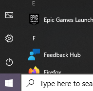
Pre Windows 10, I used to use ctrl+alt+del to access the Task Manager. Since then, I have adapted to just right click the Task bar then select Task Manager. They have removed it, but why? Now you just get “Taskbar settings”.
I always liked having the Icons with Text on the taskbar. Now you can only have icons. Why isn’t there an option in the settings? Surely that’s not an oversight, they have intentionally removed that. Why?
I intermittently remember that a cool way of minimising all windows is to grab one window and shake it with your mouse. This feature is off by default. You have to turn the feature on in the Settings menu. It is called “Title bar window shake”.
The biggest annoyance is that windows no longer maximise when you drag files to them on the taskbar. I used to have a program open like VLC Media Player, go grab an MP3, hover over VLC, it would maximise, allowing me to drop the file in. Now you have to have a program open but windowed; open file explorer, then drag the file in, then maximise the program if you wish. I don’t understand how that has been missed when developing, and going through all the stages of testing. I noticed it on Day 1.
Microsoft are boasting about a more consistent aesthetic, and a new sleeker look with rounded corners. Previous Operating Systems had a mix of aesthetics due to some dialogs being remnants of the older OS like XP, 7, 8 etc. Now everything looks the same. Or so they claim. They have definitely missed some, Device Manager being one example. This is annoying for those that like a certain colour scheme like a Dark Mode, then when opening Device Manager, it’s going to be White themed because it’s a legacy dialog.
A criticism other people have is that Microsoft are more pushy to use their ecosystem. It’s almost vital to have a Microsoft Account. Microsoft Edge is your default browser and cannot be uninstalled. It can be changed but the experience is a bit more clicky to change the Default App settings. Then there’s quite a few Diagnostic data collection options that are enabled by default.
I tend to use my laptop for simple stuff like for Web Browsing, and writing blogs. I have a PC for gaming. I have played a few games on Windows 11 though and it ran fine, and haven’t had any problems with incompatibility. I heard that the “drag and drop maximise window issue” is going to be fixed in an upcoming update. Hopefully, they can add the Task Manager option in, and give more customisation of the Taskbar in general.
When you visit a website and have to consent to cookies, the user experience is often confusing. The wording, or the appearance of controls look like they are designed to mislead.
Sometimes when you see options and they look disabled by default, I wonder if I am misunderstanding what the dialog represents. So even when you close the dialog, have you really consented?
Additionally, how do I really know that my options have been saved and used correctly? Unless I see an advert for something I looked at on a particular website, I am oblivious to what a website stored about me, or sent on to their many partners.
Someone has made a short “game” which illustrates how bad these consent dialogs are.